Tuesday, 28 February 2012
Creating the Advertisement
We decided on a half page spread because of the interesting shape and the long design will work nicely with the photography idea.
Monday, 27 February 2012
Business cards


These are the BookKlub Business cards which i have come up with. i kept them super simple and minimal as i wanted to keep it in-keeping with the current design of the zine and Sophie's leaflets.
I plan to keep the print costs down and print them off in the mac suit for 2p a sheet and simply duplex them with a blue middle layer making them look more expensive and professional.


Zine
The zine created by Chris and Sarah. i wanted to have a go at layout so i produced my own page, but that was all i was allowed to do. :(
We had a slight nightmare with the binding we had to make 3 separate books instead of one like we planned as iw would make it to thick and the pages would of needed cutting down to much.
Thinking we had no options Chris wanted to through in the towel as he had spent all his time creating it and it looked like it wouldn't bind.
i came up with a way to bind to properly and still have it looking projectional in the short time slot we had.
i stapled the 3 books individually creating 3 solid books.
i then taped them together along the seems so they became one. next i glued a white flap over the tape so you can't see the join.
The book works perfectly and you wouldn't even know it was a botch job.


Prints
 Here is the collective work that we had printed off to give out during the presentation. i Printed off 10 prints to give away to show what sort of work we produce. i also did the business cards which i am very happy with.
Book Binding
We had a slight nightmare with the binding we had to make 3 separate books instead of one like we planned as iw would make it to thick and the pages would of needed cutting down to much.
Thinking we had no options Chris wanted to through in the towel as he had spent all his time creating it and it looked like it wouldn't bind.
i came up with a way to bind to properly and still have it looking projectional in the short time slot we had.
i stapled the 3 books individually creating 3 solid books.
i then taped them together along the seems so they became one. next i glued a white flap over the tape so you can't see the join.
The book works perfectly and you wouldn't even know it was a botch job.


Location of the Shop
Here i quickly mocked up some photoshop location designs. The Shop is located between the universities on a main road and has a massive amount of student traffic going past it every day which is the target audience we are trying to appeal to.
We will have the shop at the bottom and refurbish the upstairs to be an in-house print facility.


Looking at Business Bank Accounts
I looked into making a business back account on a Natwest website and see what information like the business number was needed to receive one.


Dishing out Jobs
Sophie had desicded on a list of role we needed to perform within the business and durning a group meeting we discused who would undertake what roles.
this is the results of this discussion.
CHRIS
* Creative Director
* Retail Assistant
MATT
* Head Designer
* Retail Manager
* Retail Assistant
SOPHIE
* Promoter/Marketing
* PR & Networking
* Retail Assistant
SARAH
* Accountant/Financial Director
* Retail Assistant
this is the results of this discussion.
CHRIS
* Creative Director
* Retail Assistant
MATT
* Head Designer
* Retail Manager
* Retail Assistant
SOPHIE
* Promoter/Marketing
* PR & Networking
* Retail Assistant
SARAH
* Accountant/Financial Director
* Retail Assistant
Sunday, 26 February 2012
Print Design
Here are the prints which i have created for enterprise. i chose to look at colours and heavily type driven. They are simple and yet attractive and am happy with the results


Enterprise Tutorial
Today our group had a meeting with Jane to talk about where we are up to, our business plan and to talk about any issues we have come across.
We had a good chat and Jane seemed to be enthusiastic about our business and gave us a great deal of useful information to look into such as:
- Magma
- Nobrow
- Look at our target audience
- retail space look at Hype Park and Woodhouse
- Promotion at freshers fairs


Final Logo

This was the final logo we decided on as a group and they didn't mind the fact about changing the C to a K to much and we are all happy with the design.
Logo Development
As we are using photography for the advert i decided i would take charge of the logo as i haven't got much camera skills as Chis or Sophie and i feel like logo development is one of my stronger skills.
These is my progressive design to come up with our logo

Here is the process step by step.

My frist idea i looked at calling i used the words Book Club but the words didn't sit well together as the "B" at the start and at the end and both words been 4 letters give the impression of been chimerical. To solve this i removed the C and just went with the K in the middle and it still reads the same.

Experimenting more with using a K instead of the C

This i really like the BKKB overlapping slightly. this would make a really nice symbol for a logo.

I experimented more with different typefaces to see if it could be improved.

use of gradients and colour experiments.

Making the symbol look more like a book here although i do prefer the flat version.


More experiments with the BKKB. Really enjoyed doing this and i will have to convince the group to see if we can change the company name to Book Klub because turning your C to a K is way KOOL.
Business plan?
All coming together we had decided on looking on promoting the Northern Print capital as the south has London as it creates a community and wel feel the North not been short of design talent coming from Leeds, Manchester and Newcastle mainly we decided to create a business which will make more of a community and help promote the North.
We decided on the name "Book Club" which i feel is a great name as it gives the impression of a group and almost inviting.
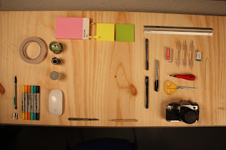
After been given the task of creating a Creative Review advertisement with our company name, slogan and also our talents. Instead of just listing our talents i thought about photographing products which demonstrate out skills like print related objects, tablets, pens, cutting matts, camera and things like that. Then to demonstrate we are a print company have a mock up magazine cover with our logo on in there as well.
We decided on the name "Book Club" which i feel is a great name as it gives the impression of a group and almost inviting.
After been given the task of creating a Creative Review advertisement with our company name, slogan and also our talents. Instead of just listing our talents i thought about photographing products which demonstrate out skills like print related objects, tablets, pens, cutting matts, camera and things like that. Then to demonstrate we are a print company have a mock up magazine cover with our logo on in there as well.
Saturday, 18 February 2012
Skills Within Group
The skills i feel i bring to the group are
Logo Design
Software Skills
Productive Ideas
Works well in a team
Printed and Web design
The other members bring different aspects and skills into the group such as
Illustration
Research
Software Skills
Group Management
Development
Leadership
Animation
Photography
Stop Motion
Time Keeping
Photography
Enterprise
My enterprise group consistis of :
Me
Chris Van Niekerk
Sophie Wilson
Sarah Roberts
I am excited about working in this group as i have never really seen myself collaborating with Sophie and Sarah as our designs and ways of working are completely different to mine. I think this would be a good thing as it brings me out of my comfort zone and allows me to try some new things.
Wednesday, 8 February 2012
Subscribe to:
Comments (Atom)